The Core Law: High-Converting Assets Are Sculpted, Not Guessed
Most business owners believe high-converting marketing materials are created in a single burst of creative inspiration. They sit down, write a 30-page PDF, put it behind a lead form, and then wonder why nobody reads past the second page.
In direct-response systems, that approach is backward. A high-converting asset is never created in one sitting. It is sculpted through continuous feedback, simplification, and deep audience empathy.
In this behind the scenes case study, we are documenting the core decision points in our lead magnet: Low-Code Funnel Infrastructure. We will look at where we started, the major structural correction we made in Version 3, and why the final deliverable was redesigned for maximum legibility.
Mining Search Demand Before Writing a Word
Before writing a single headline, we avoided the biggest mistake in content creation: guessing what an audience wants.
We gathered real search intent data using tools like Google Keyword Planner, AnswerThePublic, and live search intent indices to see what founders and service providers were actively looking for. The data pointed to a clear bottleneck:
- Founders were tired of paying $10,000 developer retainers just to launch a straightforward client acquisition funnel.
- Search queries for low-code funnel setups and modular landing page blocks showed strong monthly search volume with very little high-value competition.
- The core problem was not writing a complicated 10-step sequence. It was building a reliable, high-converting pathway without needing custom developers.
With proven search demand confirmed, we started building our single-page asset around that specific answer.
Version 1: The Initial Dark Specification Draft
In the first draft, the initial instinct was to make the document feel deeply technical, dense, and heavily authoritative.
The Initial Draft: Sleek, Dark, and Heavily Technical
We built a dark-mode blueprint featuring military-style classification tags, abbreviated data points like "6.6% vs 1.8%", and technical jargon like "Friction Threshold" and "Intent Matching".
The dark-mode technical specification layout with dense data chips and military metadata.
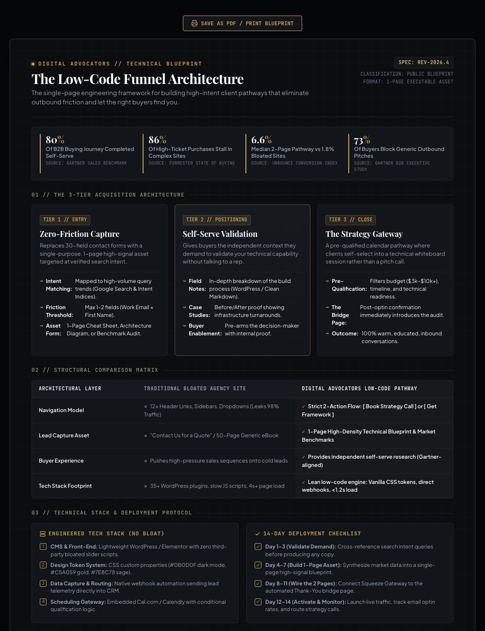
The lesson was immediate. It does not matter how technically accurate your document is if the reader feels intimidated. When an asset feels like an engineering spec, it creates friction instead of trust.
Version 3: The Unified Roadmap and Plain-English Shift
After recognizing the flaws of the initial draft, we made a substantial leap forward in Version 3. We moved to a light editorial palette and focused on structural consolidation.
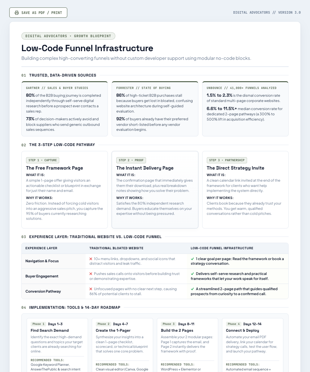
Merging Tools, Adding Context, and Cleaning Up the Contrast
We switched to a crisp light theme with our brand sage green badge. We spelled out the complete findings from Gartner, Forrester, and Unbounce in plain sentences. We also reworked our comparison table to focus strictly on the Experience Layer (Navigation, Buyer Engagement, and Pathway). In our earlier draft, we were downplaying 10-question forms, but we realized that ignored that quiz funnels have a legitimate, high-converting place in marketing. We also merged the tools and the 14-day timeline into one unified block, adding helpful clarity like specifying that Systeme.io is a free funnel builder.
The light editorial layout combining tools and the 14-day timeline into a single unified block.
The Final Result: An Open Layout Designed to Breathe
Even after bringing the copy into complete alignment, the boxed-in design still felt visually crowded. An executive cheat sheet should feel effortless to scan.
In the final version, we redesigned the layout to prioritize open whitespace and legibility:
- Removed Card Clutter: We eliminated the heavy bordered boxes and laid the stats out as an open two-column list with thin divider lines.
- Enlarged Key Numbers: We increased the percentage figures to a bold 44px so the research immediately commands attention.
- Full-Width Header: The header now stretches across the full width of the document with clean, direct phrasing.
- Connected Pathway: Instead of disconnected boxes, a simple numbered line connects the three steps.
- Larger Body Text: All descriptions and roadmap text were scaled up for immediate readability.
We intentionally do not preview the full final design on this page. To see the finished, high-resolution layout and keep it as a practical desk reference for your business, you can download the complete printable PDF by providing your name and business email below.
Get the Low-Code Funnel Infrastructure Cheat Sheet
To receive the final, clean single-page cheat sheet we built throughout this breakdown, enter your name and business email below. You will get instant access to the printable PDF, including the full Gartner and Forrester benchmark indices, the 3-step pathway, and the 14-day roadmap.
ENTER YOUR NAME AND EMAIL TO GET THE CHEAT SHEET →Universal Rules for Building Your Own 1-Pager
If you are creating a 1-page lead magnet for your own consulting or agency practice, keep these practical principles in mind:
- Validate Search Demand First: Never write about what you assume people want. Research what your target audience is actively searching for online.
- Spell Out Your Data in Full: Avoid cryptic shorthand. Mention the research source, write the complete sentence, and explain why the statistic matters to their business.
- Keep the Focus on the Reader: Remove internal spec tags, corporate credentials, and career credits from your free assets. The reader is there to solve their own problem, not read a resume.
- Respect Proven Marketing Formats: Do not criticize formats like quiz funnels or applications without context. Highlight differences without being dogmatic.
- Prioritize Whitespace Over Boxes: If your document feels cramped, remove the borders. Big numbers, clean typography, and open whitespace make a guide look executive and easy to read.
Your systems speak for themselves when you have the patience to strip away everything that distracts from clarity.
